
Talking to technicians across countries showed us similar workflows but very different tools
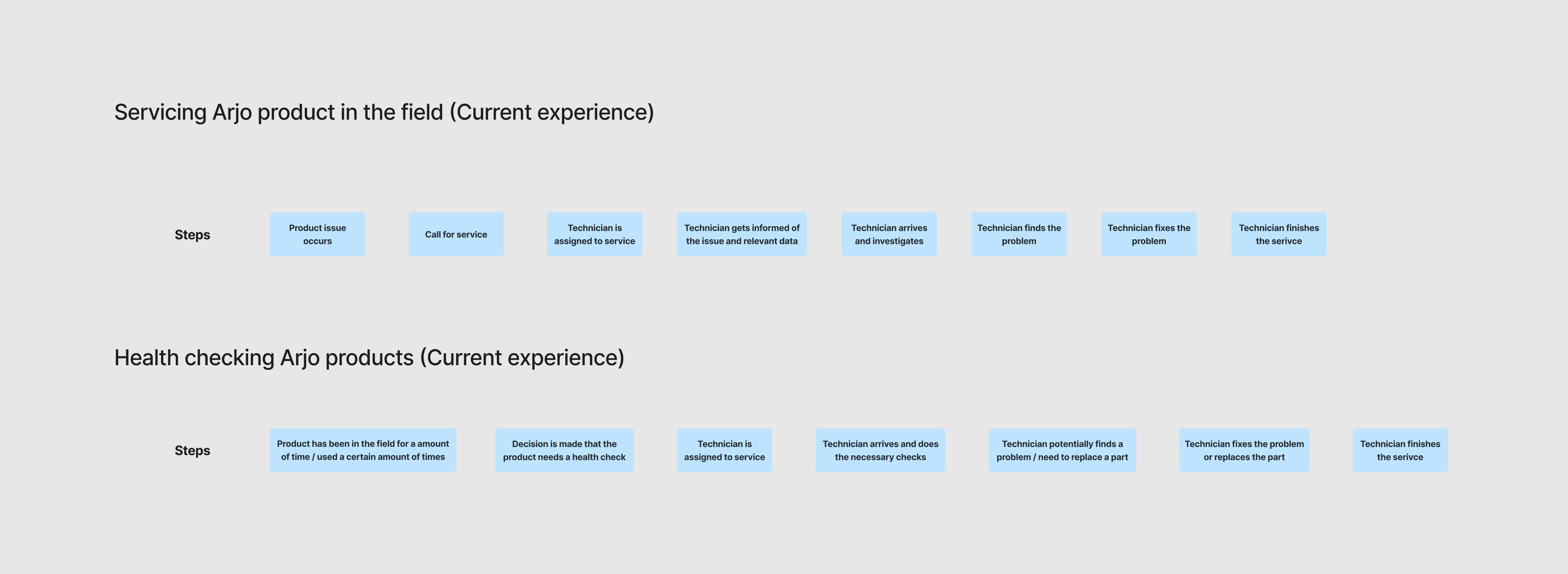
We interviewed 6 service technicians from different countries to map out how they work and what data they need. Their workflows turned out to be similar across the board. The most important thing for everyone was getting as much information as possible about a product before servicing it. Error codes and error history were especially valuable for troubleshooting.
The bigger finding was around systems. Almost every country used different internal tools for tracking products and service history, with different capabilities. Some technicians wanted the dashboard to replace their current system, others wanted it to integrate with it. On top of that, the software used to extract data from Arjo products was inconsistent across products and often hard to read, so technicians mostly skipped it.
The fragmented systems landscape meant the dashboard would need to account for very different needs depending on country, something that would need to be central to any future product decisions.
Testing a coded prototype with the same technicians gave us concrete feedback
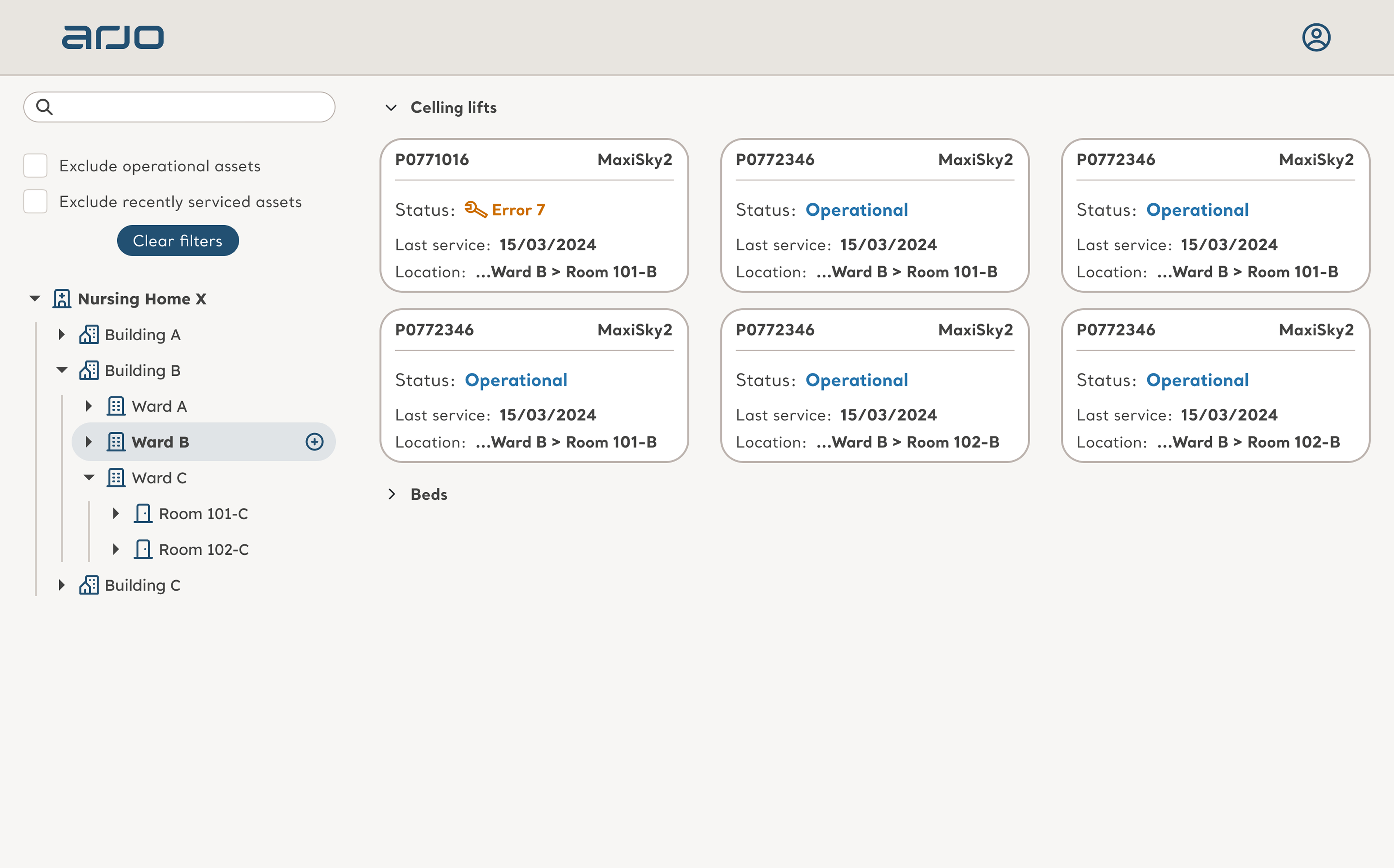
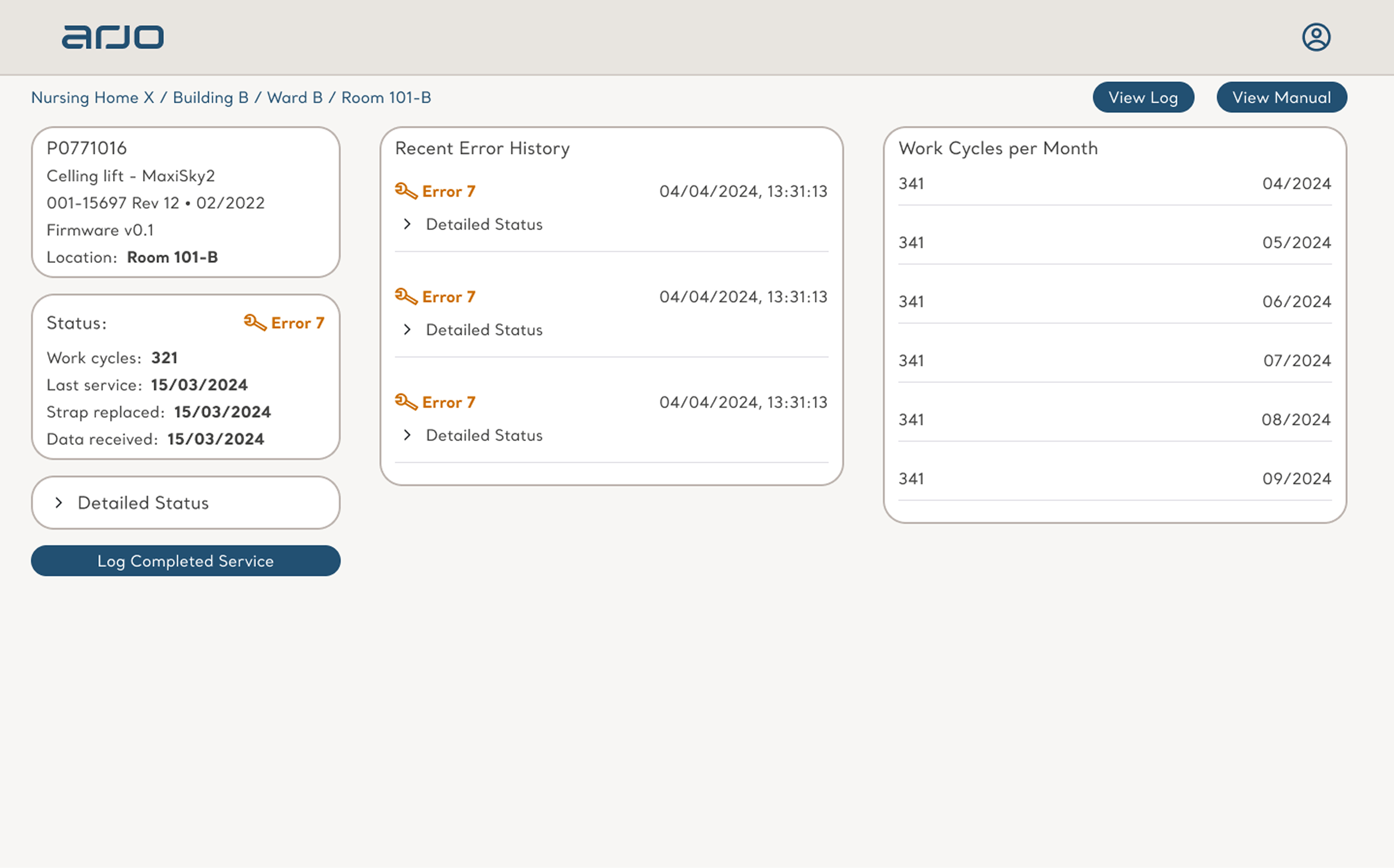
We designed the dashboard with a focus on how to display content and make it functional quickly. While we worked on the design, the developer built it in parallel using dummy data, giving us something real to put in front of technicians.
We tested with 5 of the technicians we had spoken to earlier. They clicked through it and reacted to whether the content matched what they actually wanted to see. The feedback was positive on the data itself, they wanted some things prioritized differently and more product history visible. The conversation kept coming back to how the dashboard would fit with the systems they already use. We iterated on the feedback, and when we checked back in they were happy with the changes.
A working proof of concept gave Arjo the insights to plan their next steps
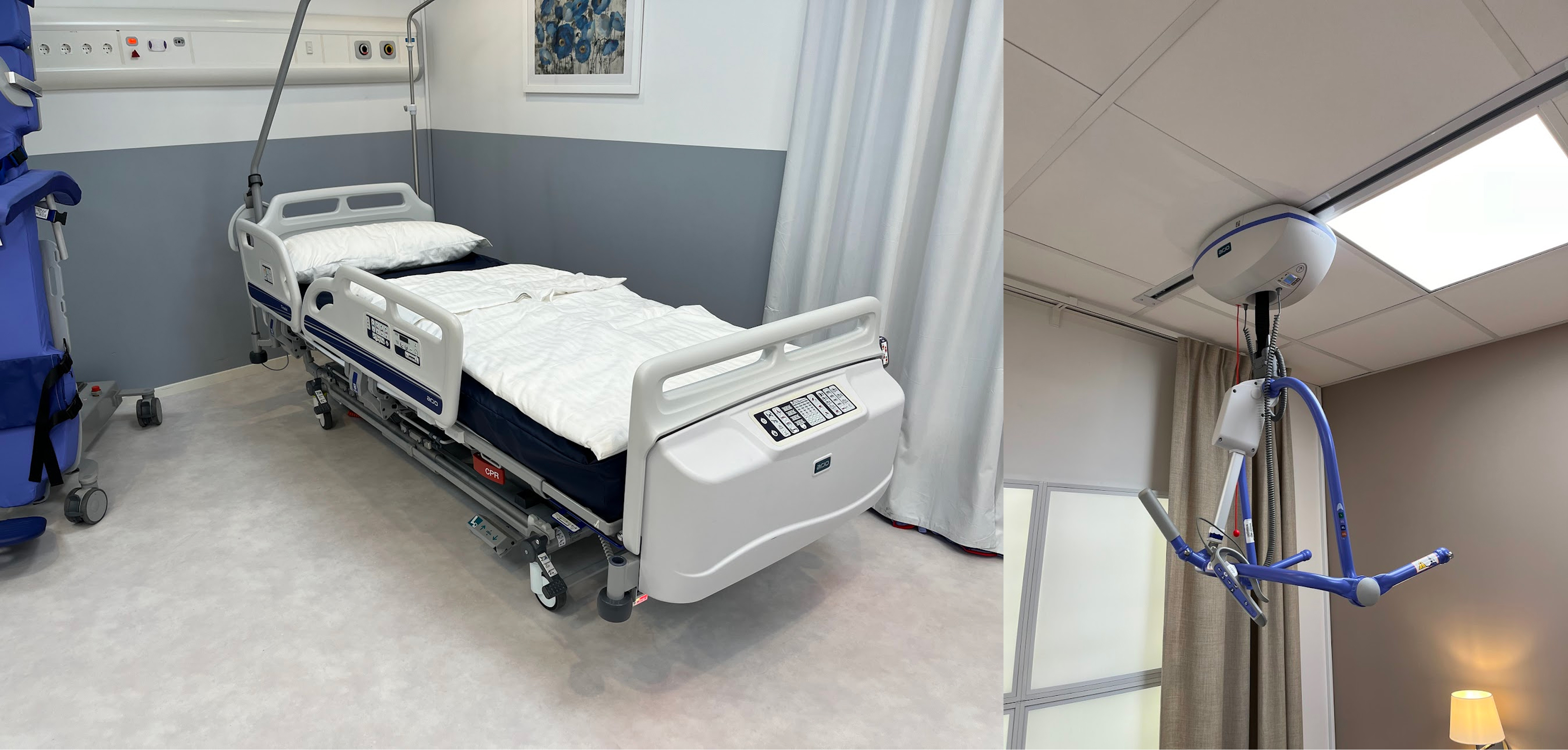
Throughout the project we ran regular demos with Arjo stakeholders to share progress and findings as we went. By the end we had a proof of concept that displayed product data in the dashboard and updated it with real data from a ceiling lift, using a Raspberry Pi prototype built by a partner company.
Alongside the technical proof, we delivered research insights about what technicians need and what problems Arjo will have to solve if they take this to a real product. That gave Arjo a clearer picture of what capabilities the future product would need to meet their users' needs.